The very first website I ever built was a personal website. It was called cheesy-hot-dog and was hosted for free by o-f.com. It was truly awful. But it was mine and I was proud of it.
Since then, I’ve never made another personal website. I’ve been a professional web developer since 2012, and a hobbyist since 2008. I’ve made hundreds of websites, apps, and products for many other people. But never for myself.
This year I wanted that to change.
For the past few years I’ve wanted to get more into journaling, and writing in general. This year I picked the theme of “intentionality”, and as part of that I set myself goals for the year. One of them was to write and publish blog posts on topics I think are interesting or where I can share knowledge with others.
To do that, I needed a website.
Design
Design isn’t my strong suit. Like most people, I can tell when things don’t look right, and I can make something that looks okay, but the gap between ‘good’ and ‘fantastic’ is where polish lives, and I do not have the skills needed for polish.
So I started compiling a list of other blogs and personal sites that I really liked the design of in the hopes of finding inspiration and removing what I felt was the main roadblock to getting this site created. Here’s the shortlist:
Driftime • Cassie Codes • Dan Machado • Sara Soueidan • Tresmares Capital
I knew I needed the design to be minimal, so that I could create the site quickly, as well as make changes and add new things quickly too. The site, while fun to work on, should always be a means to do the work, not become the work (to a degree!).
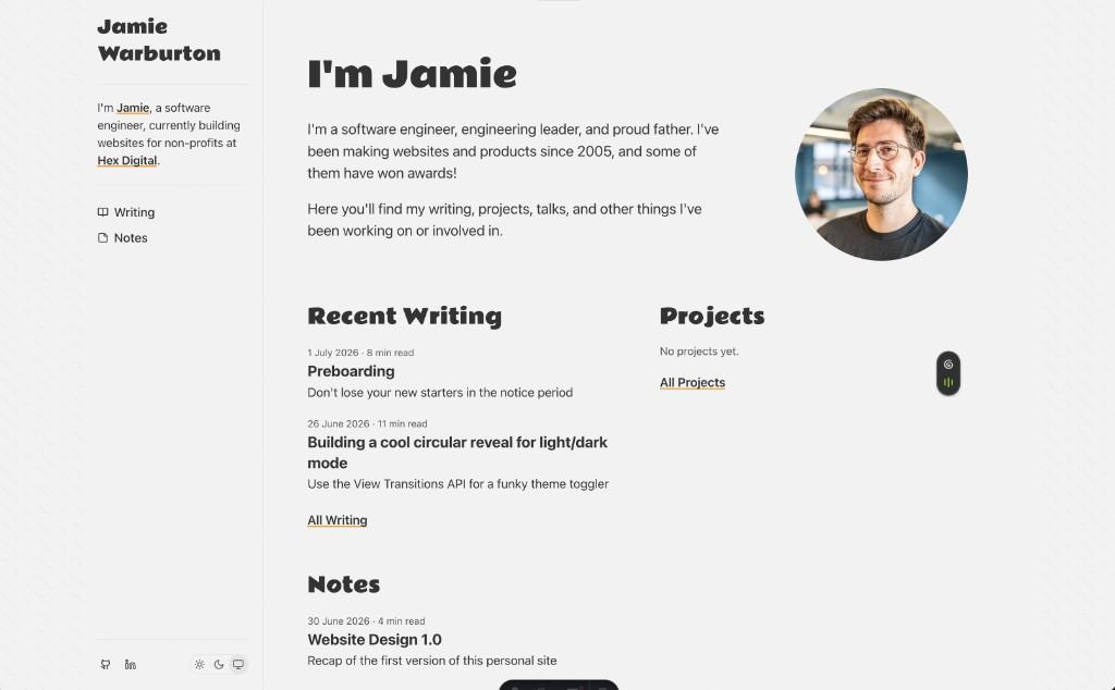
While looking through the websites above, I also came across Tania Rascia’s site https://www.taniarascia.com/. If you visit it, you’ll notice it is extremely similar. That’s because I based this site’s v1 design entirely on it. I really loved its simplicity and look and feel, and Tania did a great job on it.
Everything has been built from scratch based on how I think, but I’ve inspected a lot of properties to get the same vertical and horizontal spacing.
While it looks similar right now, I aim to change it over time and evolve it into something quite different. But for now, thank you Tania for getting me past my biggest roadblock: getting something online that looks great.
Tech Stack
This site is built in Astro and hosted on Netlify.
This stack is different for me, as my day-to-day right now is mostly building beautiful, interactive frontends in React and Next.js, and hosted on Vercel. However, this site is a static content site with minimal frontend interaction, which is where Astro shines (apparently). So it felt like the right time to check it out.
So far I’ve been quite enjoying using Astro. It is fast, and it has a lot of helpful functionality out of the box for mdx and blog posts in general. I’ve created a few custom components and remark plugins for the rendering engine, and it’s been quite straightforward to learn and use.
I’m also using Upstash for a fast Redis database. I use it to temporarily hold user likes on blog posts. These likes are synced hourly back to GitHub where the content is stored, so the likes can be stored alongside them and then can be included in future static builds of the page.
Organisation
I decided to follow Tania’s approach to content organisation, with Writing, Notes, and Projects. Andy Bell had something similar in the past that I liked, where he started adding very short posts (1-2 paragraphs) of his commentary on other articles, and posting those to his blog. I also like the idea of short-form thoughts that can start conversations.
Keeping writing and notes separated helps to declutter the RSS feed, and helps people find content and related content that is more relevant if they’re mostly focused on article content (which is more common). Notes are a little more personal or fleeting.
Screenshots
Homepage
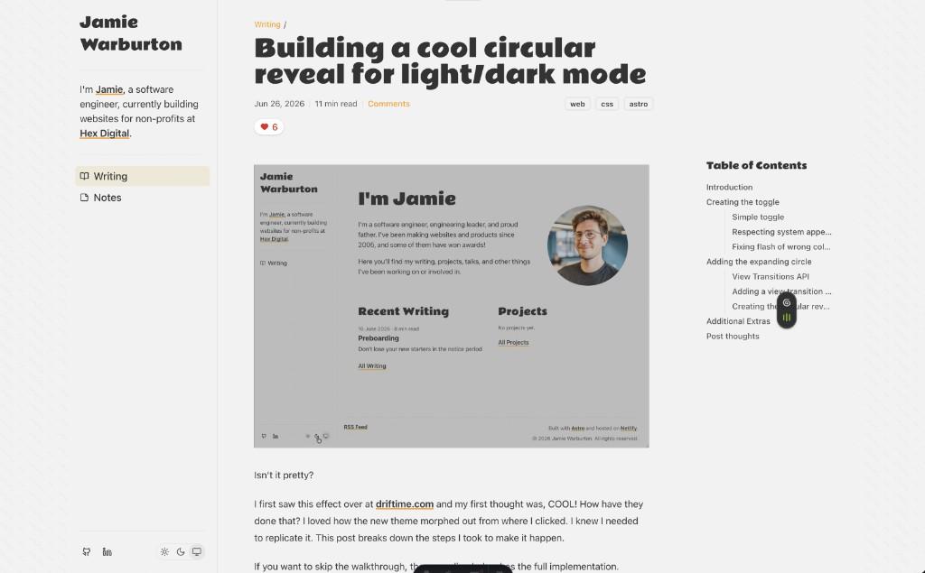
Blog Post
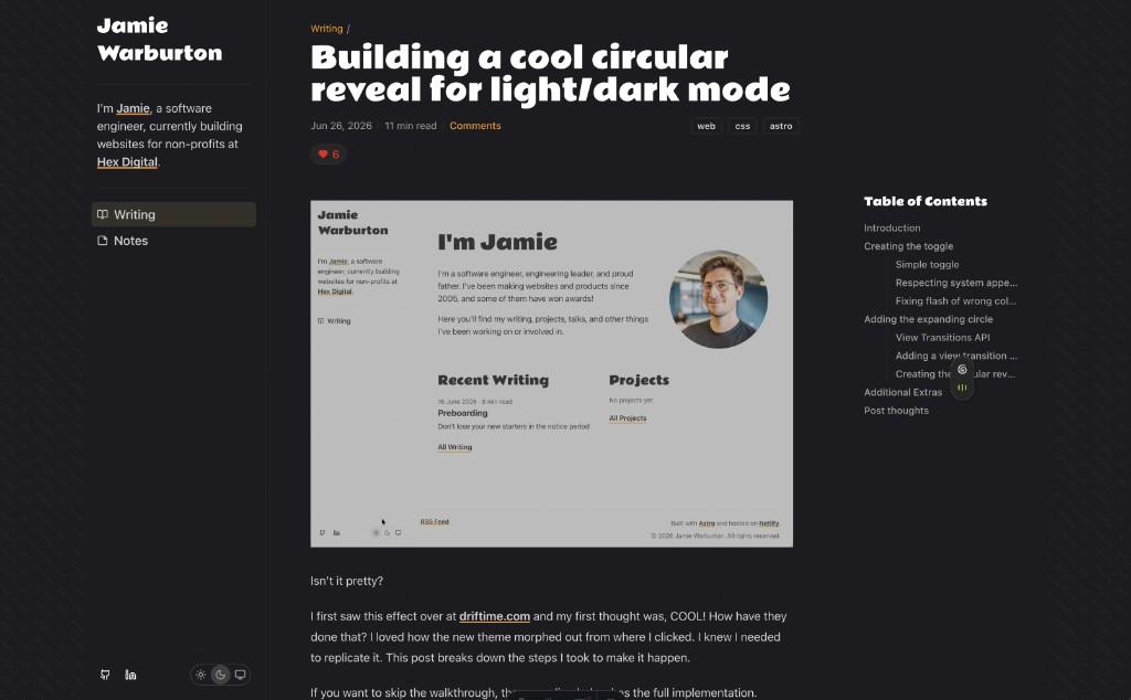
Dark Mode
Comments